


AI & Emerging Tech
Google’s logo redesign: What’s new, why it matters & who else did it

Google’s new logo marks another step in its evolution—part of a wider trend of brand refreshment. Here’s a quick look at its logo timeline, the key design elements, logic behind such updates, and who’s recently made the leap.
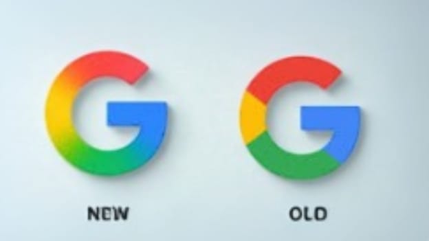
After almost 10 years of visual consistency, Google, headquartered in California, the US, has unveiled a refreshed version of its iconic “G” logo this year. The update may seem subtle at first glance, but it's a meaningful move as far as branding is concerned. The new ‘G’ features a soft gradient that blends red, yellow, green, and blue — Google's signature colours — into a sleeker, more digital-friendly form.
According to the global tech giant, the new logo aligns with its broader shift toward AI-first products and a more unified identity across platforms like Search, Gmail, Android, and Pixel devices, although there is no official explanation as to why the search engine has changed its logo. The goal appears to be simple – create a logo that looks sharp and consistent across every screen and device, from watches to televisions.
Flashback: The Evolution of Google Logo
The Google logo has evolved significantly since its early days as a search engine project called ‘Backrub’ in 1996. The original logo was associated with the project's name, which was later changed to Google. Here's a timeline of its logo evolution.
-
1996-1998: Early logos and the first official logo: The first Google logo, designed by co-founder Sergey Brin using the free image editor GIMP, showcased its name in a different color palette and typeface than the versions that followed. It was a simple, early attempt that laid the foundation for Google’s now-iconic branding.
-
1999-2010: The longest-running logo: Google's most recognisable logo, designed by Ruth Kedar, was introduced and remained in use for more than 10 years. A subtle update was made to the logo, changing the "o" from yellow to orange and removing the drop shadowing.The logo was later updated with a glass-themed variant, keeping it simple and modern.
-
2015: Product sans typeface & color-block "G": Google transitioned to a sans-serif font called Product Sans, and the icon was changed from the lowercase white "g" on a blue background to the color-block "G".
-
2025: Gradient-based design: In 2025, Google gave its iconic "G" logo a fresh new look by introducing a gradient design — the first major visual update in almost a decade. The once solid-colored segments now blend seamlessly through red, yellow, green, and blue, adding a modern, dynamic feel to the familiar symbol.
Key Design Elements: These are the core visual and stylistic components that define the look, feel, and functionality of a brand, product, or user interface. In branding and visual identity — like Google’s logo — these elements work together to create recognition, consistency, and meaning.
-
Colour story: A rainbow with a twist
The Google logo has always embraced the colours red, yellow, blue, and green, inspired by the primary hues of the rainbow. But there’s a clever twist — the use of green, a secondary color, breaks the expected pattern, symbolising Google’s tendency to think differently.
-
Typographic journey: From serif to sleek
Over the years, Google has experimented with various typefaces, starting with classic serif fonts and eventually evolving into the modern, minimalistic Product Sans — a custom-designed sans-serif font introduced in 2015 that reflects the brand’s clean and tech-forward identity.
-
Icons consistency: One logo, many platforms
From browser tabs to app icons, Google’s signature logo — and its variations like the standalone “G” icon — appear across a wide range of platforms and devices. Whether it's on homepage, in mobile apps, or within Google's ever-growing ecosystem, the logo remains instantly recognisable.
-
Google Doodles: Creativity at its best
One of Google’s most beloved traditions is its Google Doodles — creative, temporary transformations of the logo that celebrate holidays, milestones, cultural events, and iconic figures. These artistic works bring personality and fun to the otherwise static logo, making the homepage a canvas for storytelling.
Logic Behind Google’s Logo Redesign: The latest Google logo redesign isn’t just a cosmetic tweak — it’s a bold signal of the brand’s future vision. As Google stretches across more screens, platforms, and devices than ever before, the update reflects a deeper strategy: build a visual identity that stays sharp, clear, and instantly recognisable anywhere — from smartphones to smart homes. It’s not just about looking good now — it’s about staying relevant in the digital world.
Big Brands, Big Changes: Who else is Rebranding?
Beyond Google, a wave of major brands have embraced logo redesigns and rebranded their logos in the past few years, including Yahoo, Burberry, Mastercard, Zara, Burger King, X (formerly Twitter), and Walmart. These updates reflect a broader trend as companies aim to modernise their image, stay culturally relevant, and connect with a new generation of consumers in an increasingly digital and design-conscious world.
Moreover, rebranding is more than just a new logo—it’s a strategic move to stay relevant, and reflect evolution. Companies update their identity to signal growth, modernise their image, and differentiate in a crowded market. It also helps rebuild trust after setbacks or realign with new goals and values. Whether targeting new demographics or expanding services, like Meta moving beyond Facebook or Dunkin’ dropping ‘Donuts ’— rebranding keeps brands fresh, focused, and future-ready. Here are a few companies that recently underwent rebranding.
Zomato: In February 2025, Zomato, based in Gurugram, unveiled a rebrand to "Eternal" to better reflect its growth beyond food delivery services, expanding into ventures, such as Blinkit, Hyperpure, and District. This update mainly impacts its corporate name and website, while the Zomato brand and app will remain unchanged.
Godrej: Godrej Enterprises Group, based in Mumbai, refreshed its brand identity with a bold purple hue this year, aiming to symbolise dynamism, confidence, and its ambition for leadership in sustainable, design-led innovation. This change replaced the previous three-color palette with a more unified identity.
Gucci: In 2024, Gucci, based in Italy, updated its logo to a sleeker, more minimalist design. While the iconic double "G" was retained in the new version, the luxury fashion brand’s new logo features a sans-serif font and a streamlined look, indicating a move towards a more modern aesthetic.
Lamborghini: Lamborghini, based in Italy, recently updated its iconic logo after almost two decades, introducing a cleaner, more modern design with a wider typeface, a flatter, simplified bull emblem, and a color palette mainly focused on black and white with yellow and gold accents, primarily intended to be more adaptable to digital platforms.
Aberdeen: In 2025, the financial services company, based in Scotland, formerly known as ‘abrdn’ changed its corporate name back to Aberdeen Group plc. This decision followed a period where the company was branded as ‘abrdn’, seen as a source of ridicule and distraction. It changed its principal trading identity to ‘Aberdeen’.
Topics
Author
Loading...
Loading...